Hot Pink & Teal: Lost Colours Cape
This is the Lost Colours Cape, a tribute to two colours dropped from Gilbert Baker's original 1978 Pride flag. When Baker first sewed the flag for San Francisco's Gay Freedom Day Parade, it had eight stripes. By 1979, it was down to six. The two that disappeared were hot pink, representing sexuality, and turquoise, representing art and magic.
They were cut for practical reasons: hot pink fabric wasn't commercially available in the quantities needed for mass production, and turquoise was removed to create an even number of stripes for lamppost display along the parade route. The decision was pragmatic. The loss was not.
Why These Colours Matter
Sexuality and art. Of all the things to drop from a queer symbol, those two feel particularly painful. Sexuality, the thing that actually defined the community's difference in the first place, the thing that made the flag necessary. And art, the creative force that built queer culture from nightclubs and drag shows and protest posters and hand-sewn quilts. Baker's original flag honoured both explicitly. The simplified version erased them.
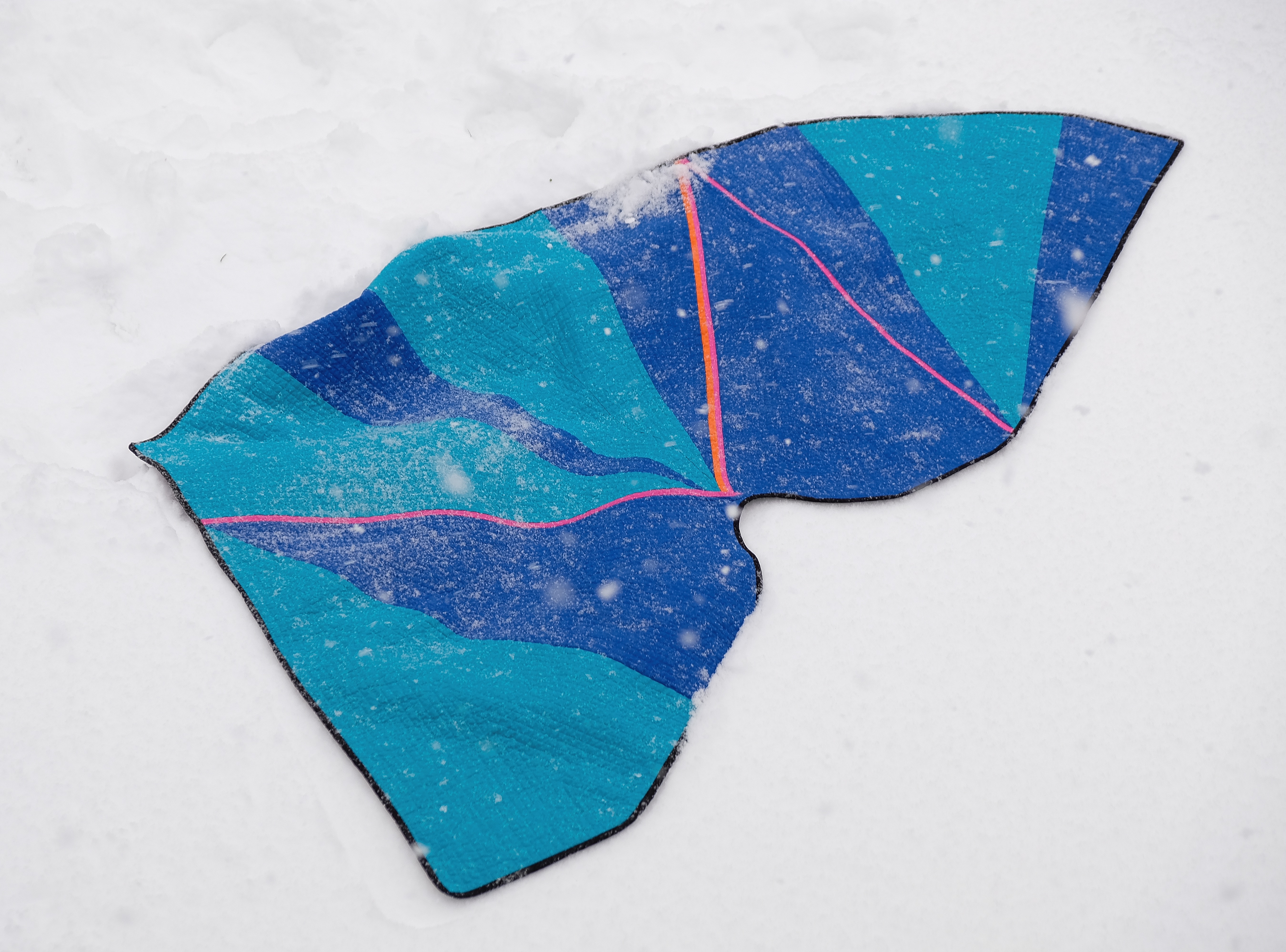
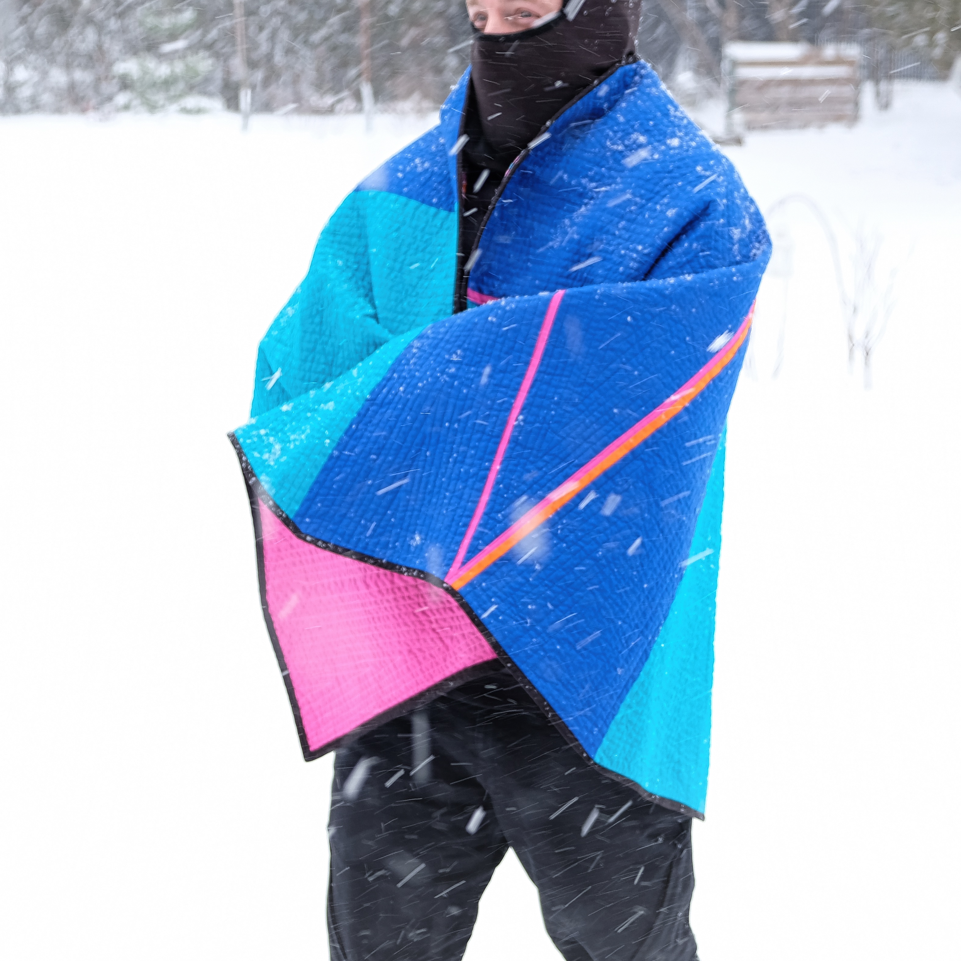
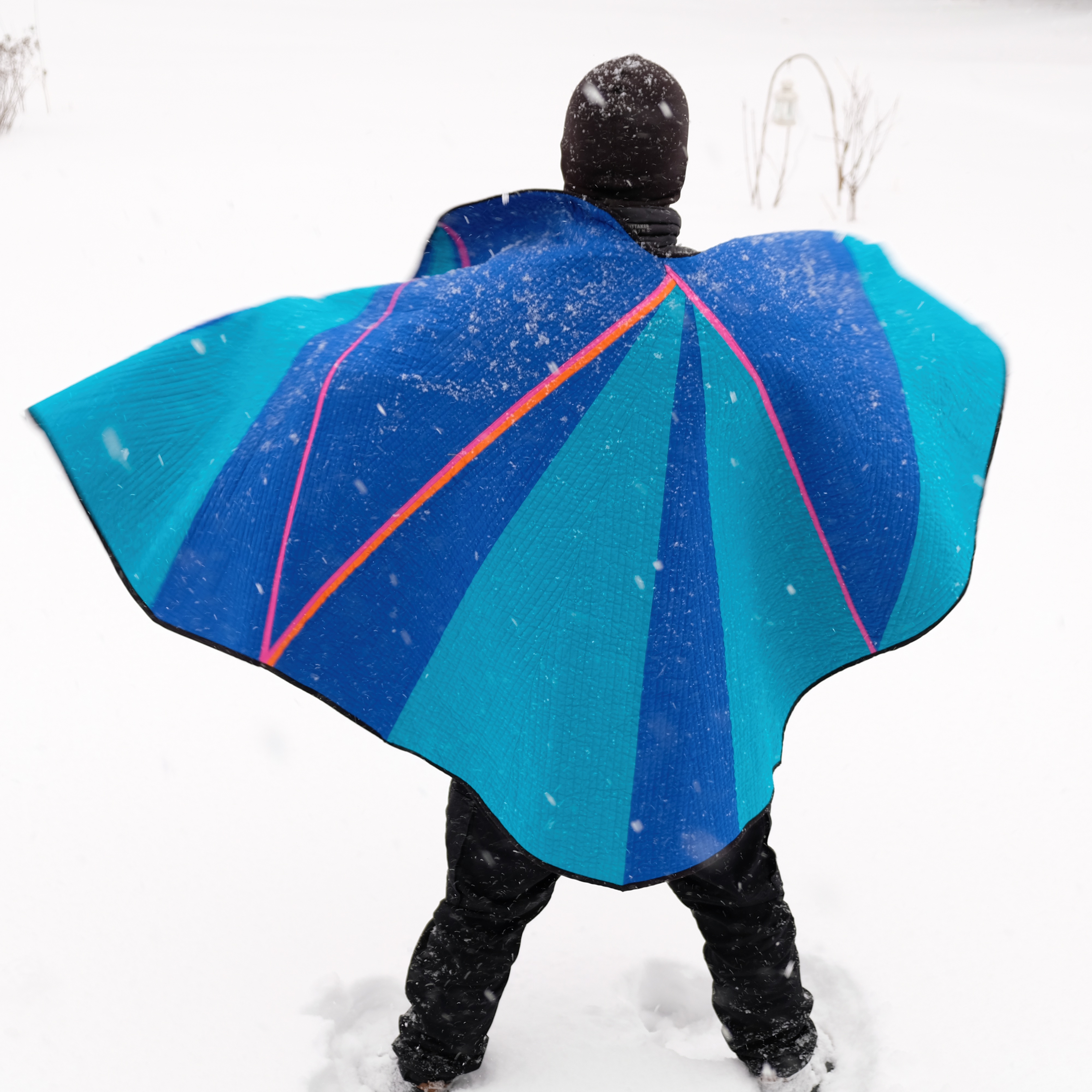
This cape brings them back. Hot pink and teal together, side by side, in fabric that can be worn and seen.
Materials
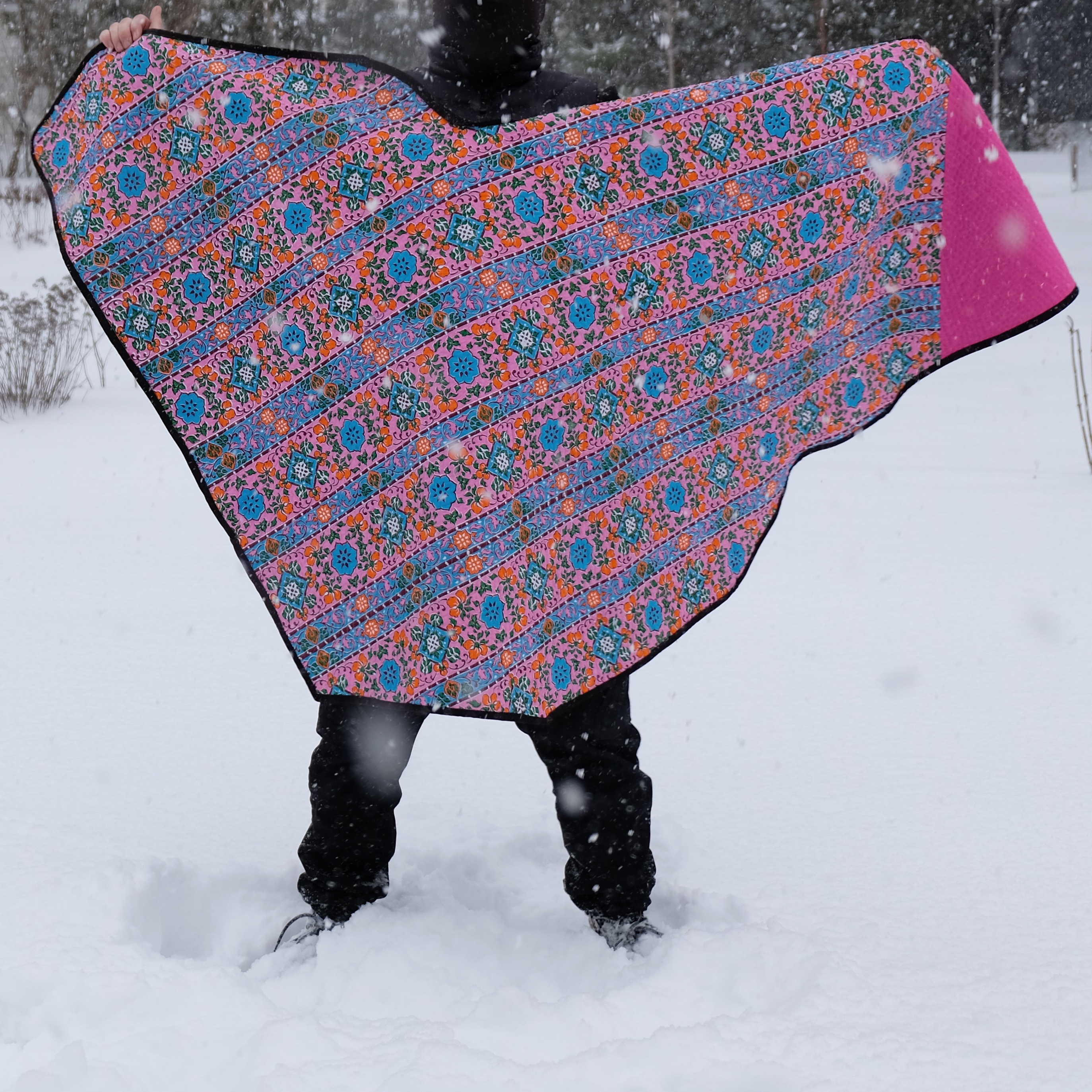
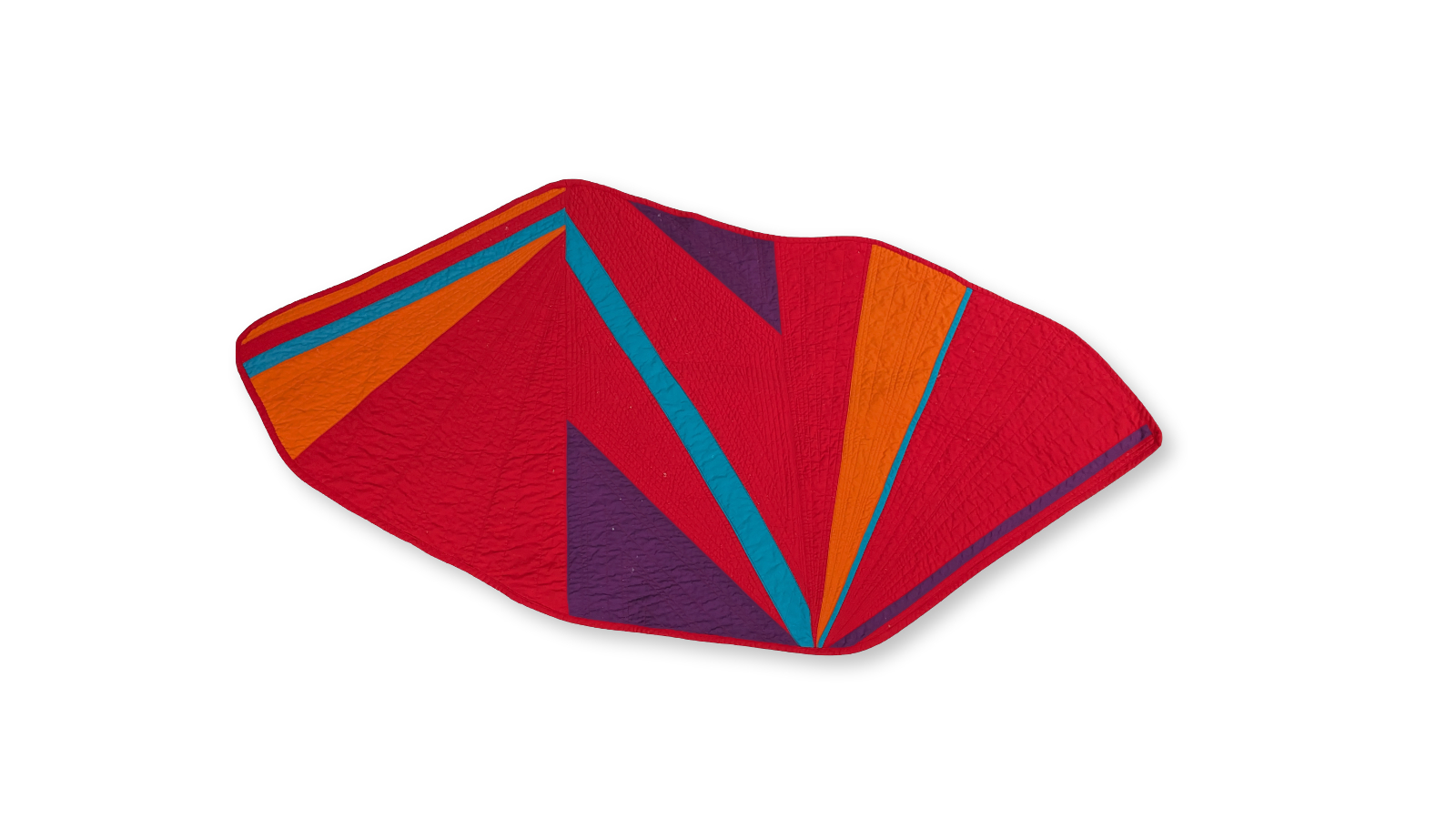
The backing is found fabric from my local thrift shop, a piece I pulled from a bin without knowing what I'd use it for. It has a slightly faded, well-loved quality that feels appropriate for colours that have been missing for forty-five years. The quilt is constructed with pieced cotton in saturated hot pink and teal, with the quilting pattern designed to let both colours hold equal visual weight.
The photos were taken in the snow outside our house in Montréal. I wanted the colours to sit against something white and cold. Partly for contrast, partly because these colours deserve to be seen in the sharpest possible light.
Part of the Colours of Pride series.