Red: Cape of Life
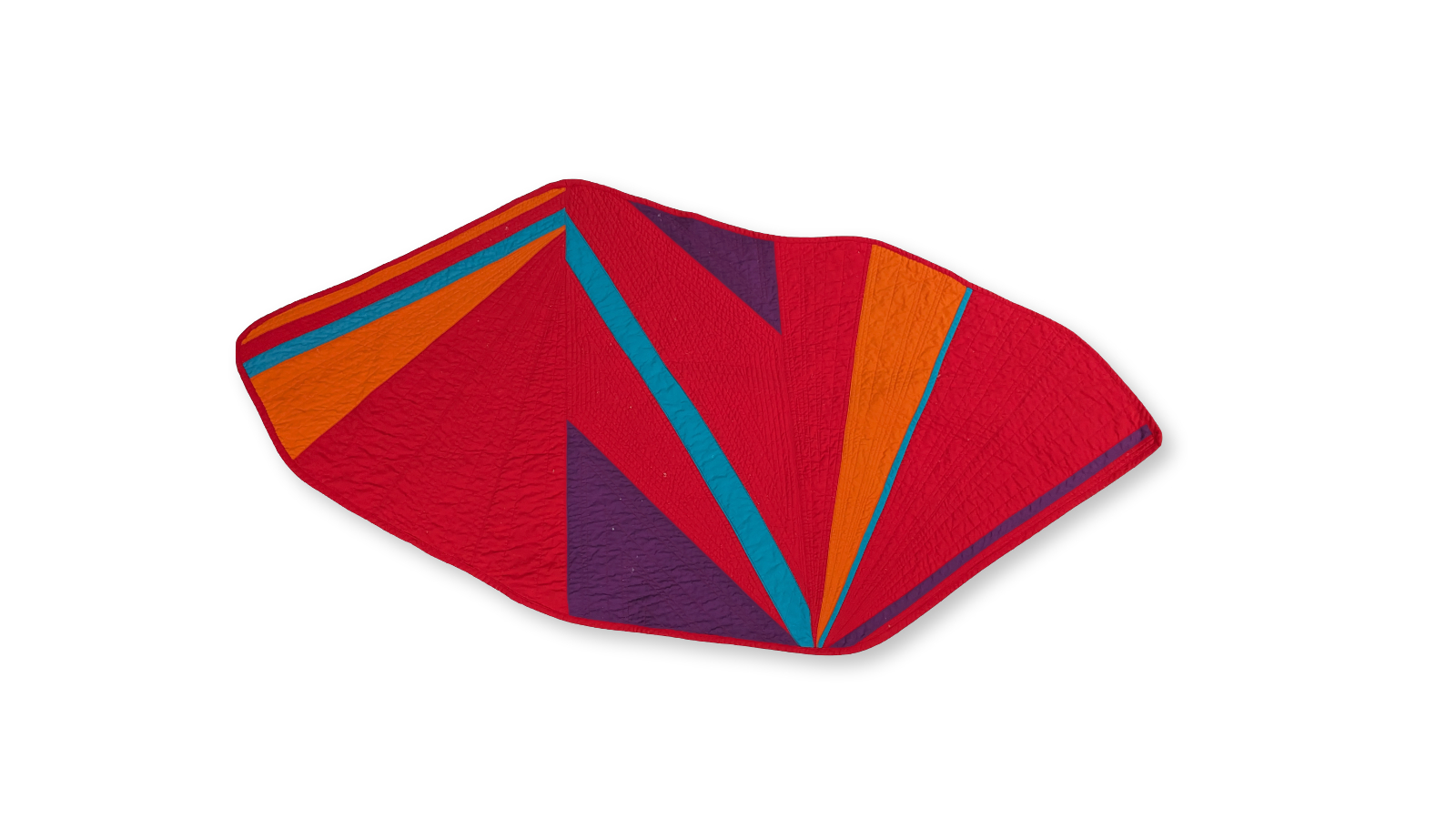
This is the first quilt I made for the Colours of Pride series, one wearable quilt for each colour in the Progress Pride flag. I started with red because it felt like the only place to start: life.
In Gilbert Baker's original 1978 flag, the red stripe represents life. It's also the colour of the red ribbon, first worn publicly in 1991 as a visual pledge of support for people living with HIV/AIDS. For queer people of a certain generation, red carries the weight of both celebration and mourning, the colour of blood drives and vigils, of Act Up protests and Names Project panels.
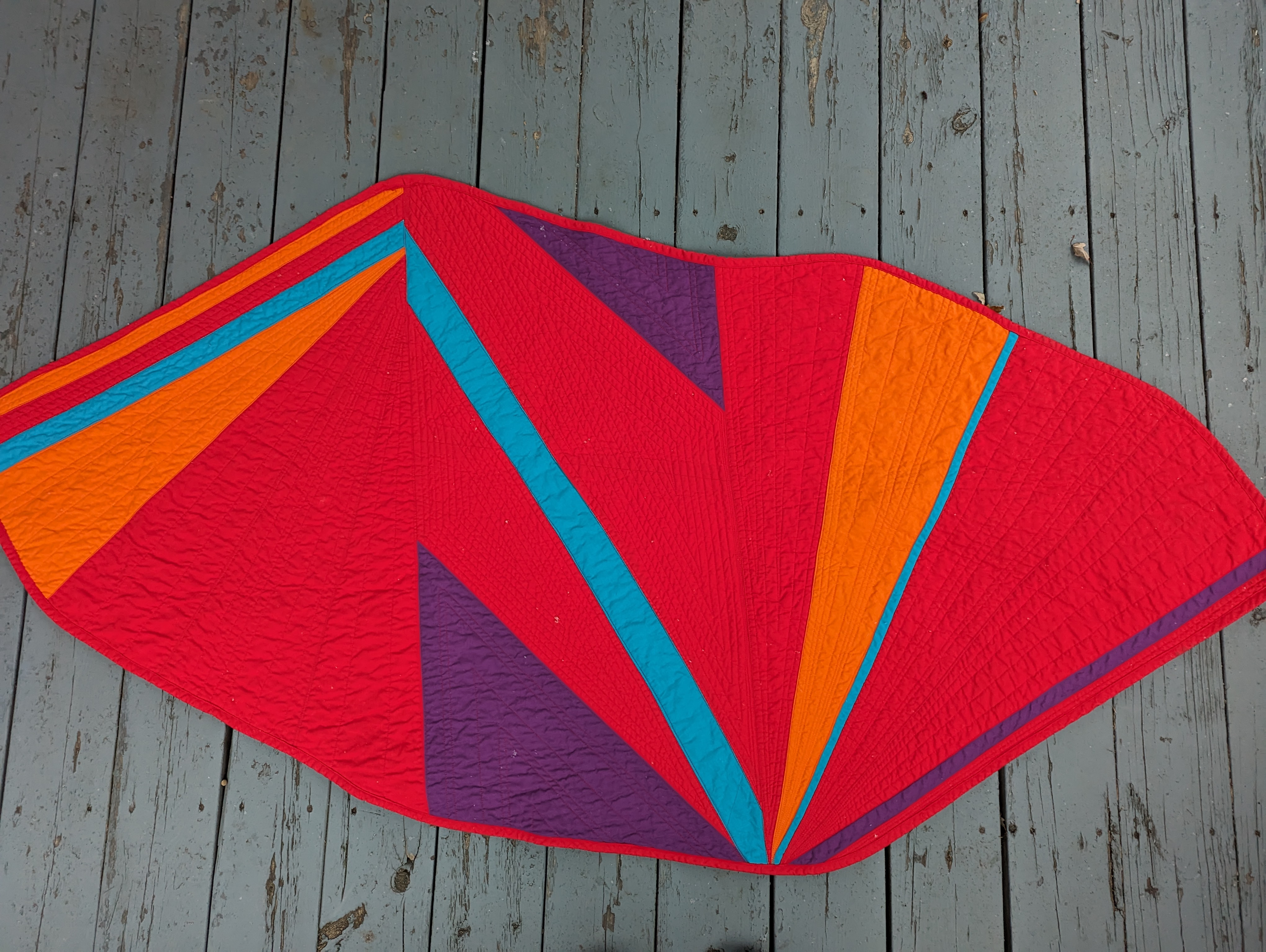
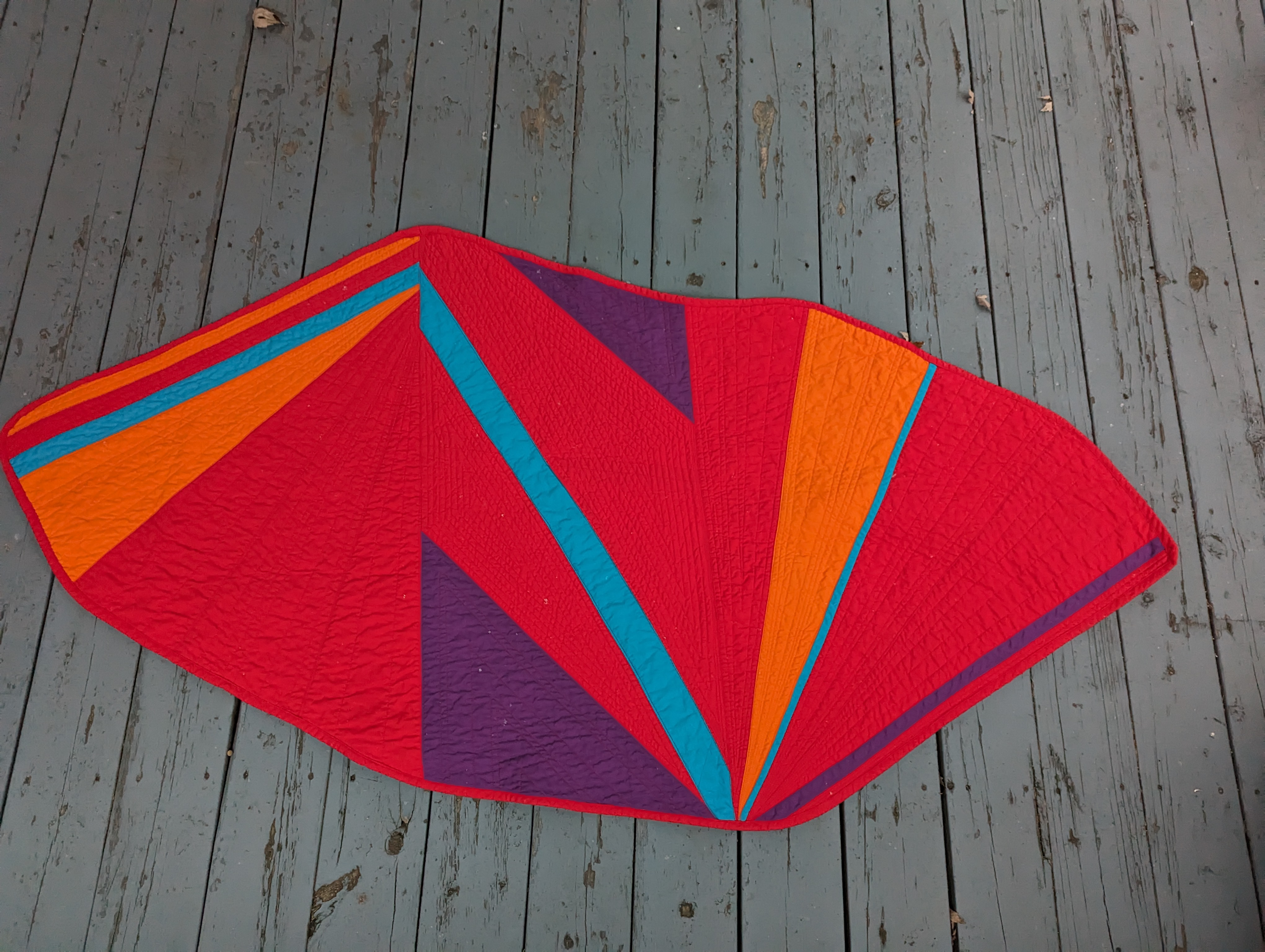
The cape features a bold teal stripe running straight through the red. That interruption is deliberate. Life is never one colour, never unbroken. The teal also nods forward to the turquoise stripe that was dropped from Baker's flag in 1979, the colour that represented art and magic. It felt right to have the lost colour show up here, inside the first piece.
Construction
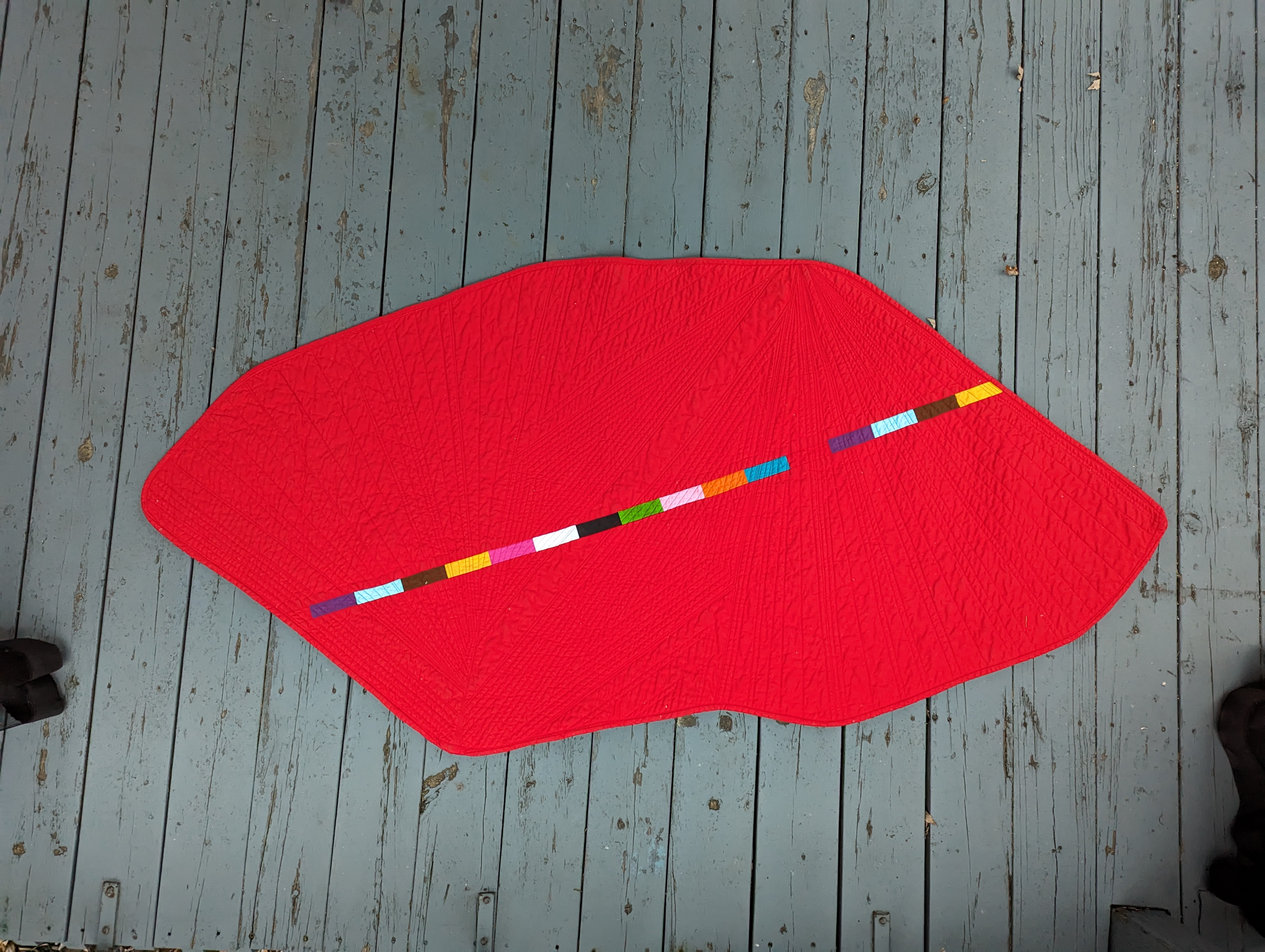
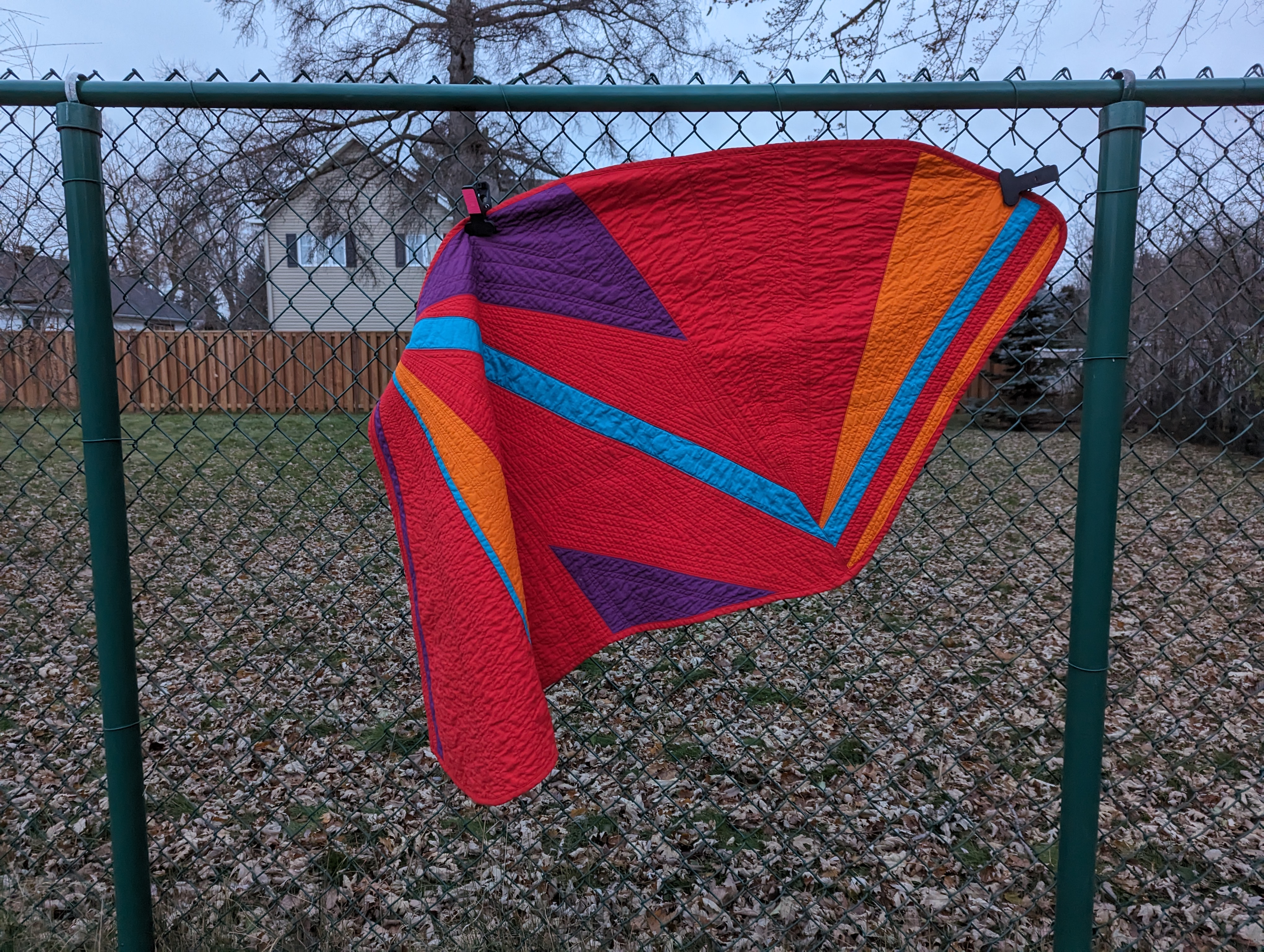
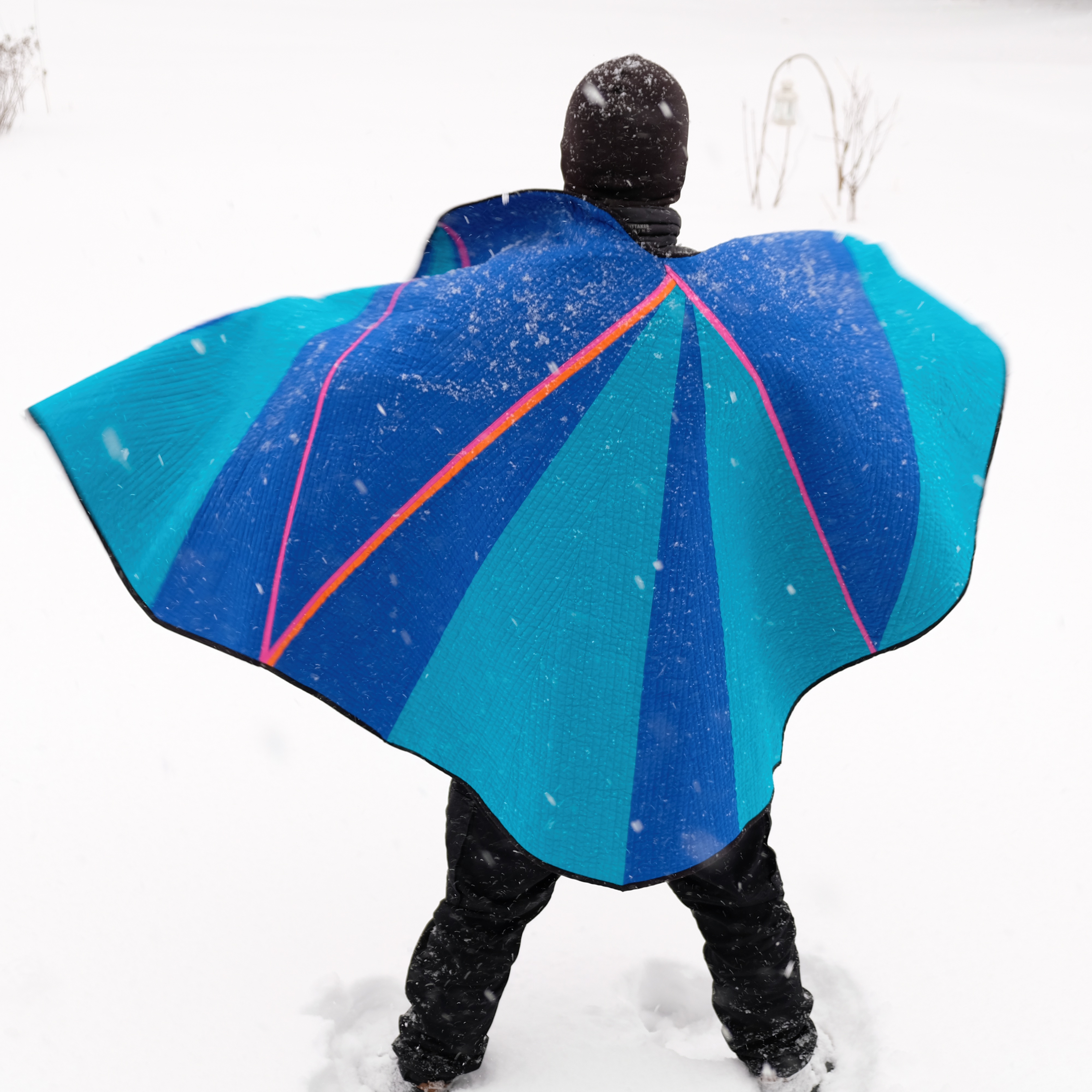
The cape is constructed from quilting cotton with a simple but bold piecing pattern. I wanted the construction to be legible. You should be able to see how it's made, see the seams, see the decisions. The quilting is dense enough to give the fabric body and drape when worn.
This piece taught me most of what I needed to know about making wearable quilts: how fabric moves differently when it's hanging from shoulders rather than lying on a bed, how seam placement affects drape, how quilting density changes the way cloth falls around a body.
Part of the Colours of Pride series.